
SELCHP & Infant Death Rate Changes Graph
This graph illustrates the changes in Infant Death Rates in three Boroughs exposed to emissions from the SELCHP incinerator located in South Bermondsey, London. Note that Wandsworth is mainly "upwind" of SELCHP and therefore relatively free from emissions.
See Japanese study of infant deaths around 63 incinerators which concluded:
"Our study shows a peak-decline in risk with distance from the municipal solid waste incinerators for infant deaths and infant deaths with all congenital malformations combined."
(J Epidemiol. 2004 May;14(3):83-93.)
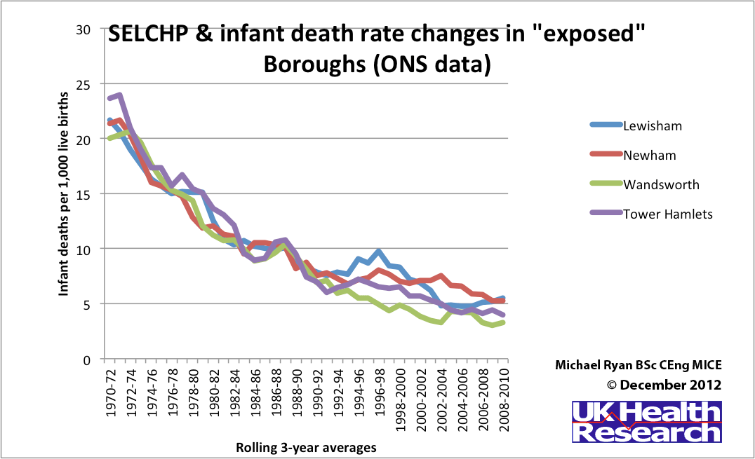
Click the graph to see it at a larger size.
About the data
In December 2012, ONS kindly released the infant mortality rates for all London Boroughs for the period 1970-2010. These data enabled me to prepare this graph showing a post-SELCHP incinerator rise in previously falling infant death rates of Lewisham (home to SELCHP), Newham and Tower Hamlets. Prior to SELCHP starting in 1993, the infant death rates of the above three Boroughs were very close to each other and also to the Wandsworth rate. Wandsworth is rarely exposed to emissions from SELCHP and the infant death rate in Wandsworth continued the downward trend after SELCHP.
From The ongoing failure of the Environment Agency and others to protect us from incinerator emissions, September 2026, page 5.